

Matplotlib yorliqlari
Syujet uchun teglar yaratish
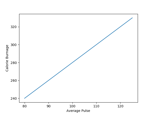
Pyplot yordamida xlabel() va ylabel() funksiyalaridan x va y o‘qlari uchun yorliq o‘rnatishingiz mumkin.
Misol
X va y o‘qlariga teglar qo‘shing:
import numpy as np
import matplotlib.pyplot as plt
x = np.array([80, 85, 90, 95, 100, 105, 110, 115, 120, 125])
y = np.array([240, 250, 260, 270, 280, 290, 300, 310, 320, 330])
plt.plot(x, y)
plt.xlabel("Average Pulse")
plt.ylabel("Calorie Burnage")
plt.show()
Natija:
Syujet uchun sarlavha yarating
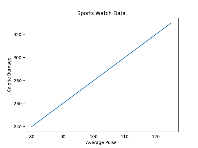
Pyplot yordamida siz title() funksiyasidan syujet sarlavhasini belgilashingiz mumkin.
Misol
X va y o‘qlari uchun syujet sarlavhasi va yorliqlarini qo‘shing:
import numpy as np
import matplotlib.pyplot as plt
x = np.array([80, 85, 90, 95, 100, 105, 110, 115, 120, 125])
y = np.array([240, 250, 260, 270, 280, 290, 300, 310, 320, 330])
plt.plot(x, y)
plt.title("Sports Watch Data")
plt.xlabel("Average Pulse")
plt.ylabel("Calorie Burnage")
plt.show()
Natija:
Sarlavha va teglar uchun shrift xususiyatlarini o‘rnating
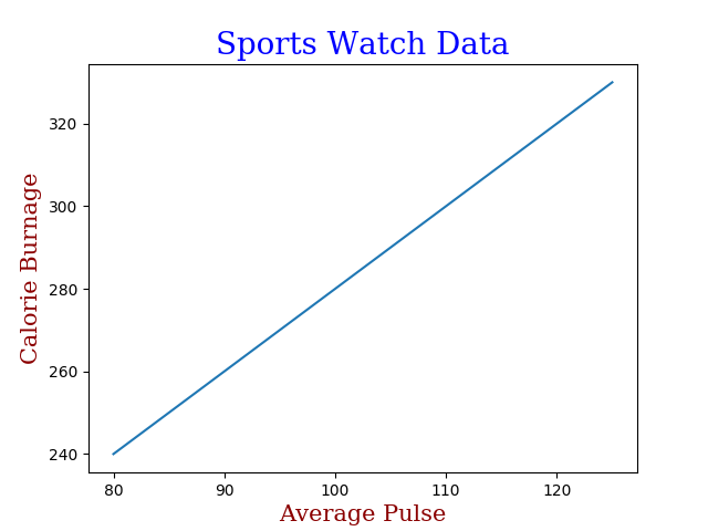
Sarlavha va teglar uchun shrift xususiyatlarini o‘rnatish uchun xlabel(),ylabel() va title() dafontdictparametridan foydalanishingiz mumkin.
Misol
Sarlavha va teglar uchun shrift xususiyatlarini o‘rnating:
import numpy as np
import matplotlib.pyplot as plt
x = np.array([80, 85, 90, 95, 100, 105, 110, 115, 120, 125])
y = np.array([240, 250, 260, 270, 280, 290, 300, 310, 320, 330])
font1 = {'family':'serif','color':'blue','size':20}
font2 = {'family':'serif','color':'darkred','size':15}
plt.title("Sports Watch Data", fontdict = font1)
plt.xlabel("Average Pulse", fontdict = font2)
plt.ylabel("Calorie Burnage", fontdict = font2)
plt.plot(x, y)
plt.show()
Natija:
Sarlavhani joylashtiring
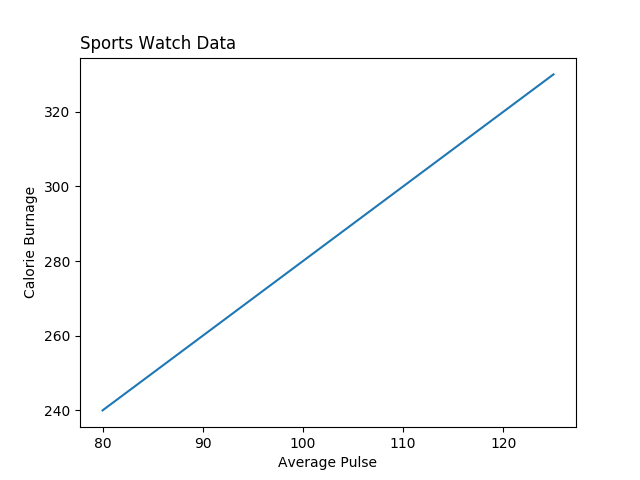
Sarlavhani joylashtirish uchun title() dalocparametridan foydalanishingiz mumkin.
Huquqiy qadriyatlar: "chap", "o‘ng" va "markaz". Standart qiymat “markaz”.
Misol
Sarlavhani chapga joylashtiring:
import numpy as np
import matplotlib.pyplot as plt
x = np.array([80, 85, 90, 95, 100, 105, 110, 115, 120, 125])
y = np.array([240, 250, 260, 270, 280, 290, 300, 310, 320, 330])
plt.title("Sports Watch Data", loc = 'left')
plt.xlabel("Average Pulse")
plt.ylabel("Calorie Burnage")
plt.plot(x, y)
plt.show()
Natija:
W3Schools Pathfinder
Yutuqlaringizni kuzating – bu bepul!